I think we pretty much said it all in our video evaluation. We managed to be concise, and tried not to ramble too much, which was good because I know we could've talked for HOURS about our project. At times we spoke over each other a bit, but it just showed how passionate we are about our work. We used clipboards, cue cards, and each other for information and prompting, and successfully used examples (real albums, Youtube clips from real music videos, clips from our music video, real bands' myspace pages) and I think we presented our project well. We divided the questions up so that we could work in more detail on the answers, and so each of us led parts of the questions. In spite of this, we all contributed to all questions, and had more of a conversation about the answers as opposed to just listing them.
I've really enjoyed working on this project with my lovely group, and the fact we are all so proud of our work must be a testement to how good it is!
Even our evaluation itself was done using new media technologies - instead of it being an essay on paper, or a blog post, it is a video, which harnesses new technology, making it more creative.
Here is the Pussy Cat Dolls logo that we talked about.
It would've been a nice idea to create a marketing campaign as there is so much opportunity online with viral marketing campaigns, so if we had more time, we would've liked to have experimented with that.
Here is part 1 of our answer to Question 1. This focuses on the analysis of the Music Video using Goodwin and Vernallis, which is led by Amelia and Holly.
We split Q1 equally, but I had already started analysing the music video, so here is my analysis chart:
(for some reason it won't let me rotate it)
Here is the second part of Q1. This focuses on the analysis of the Album Cover and the Myspace. I led the Album Cover analysis, and Charlotte led the Myspace analysis.
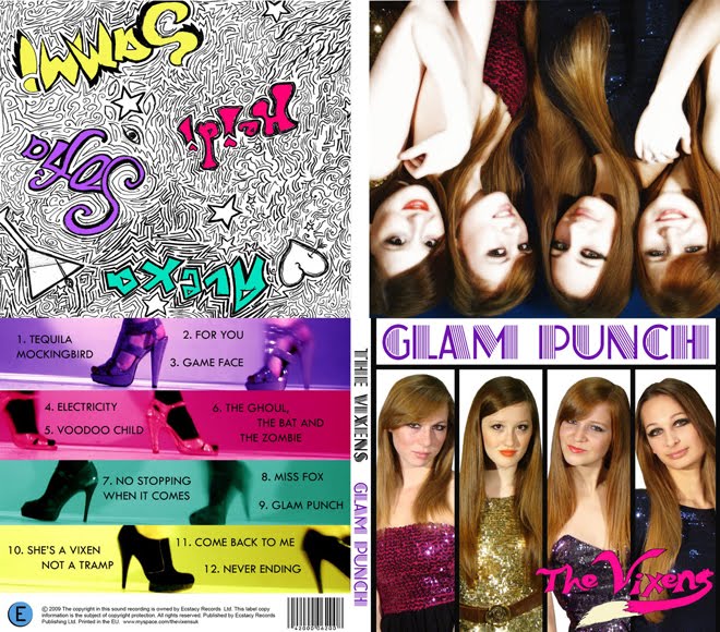
I wanted to add to the Album Cover analysis by talking about our branding and how it comes across. We’re a bit different to other girl bands because we all look similar as opposed to having “the blonde one” “the redhead” etc. This is unusual because it means that perhaps we, as individuals, are less recognisable, but for the band image it is quite good, since whenever someone sees a girl who looks like one of us 4, they will think of The Vixens. It makes us look less manifactured, since we're not trying to be stock characters, we're just being ourselves.
Also, we thought we'd be a bit experimental with the Song Names, showing the band image as being fun and original, with names such as "Tequila Mockingbird" (referencing the book "to kill a mockingbird" but with Tequila added...) and "The Ghoul, The Bat, and The Zombie" (referencing "The Good, The Bad, and The Ugly"). These songs are a play on words, and have familiarity, since both of those references are well-known.
I did an analysis chart for the album cover too, which is here:
We copied a technique that Amelia saw in Beyonce's video for her song "Videophone" where you crosscut frame by frame between two shots, making it flash very quickly. People liked this, and you can see it in her video at 1:29. We used this in our video twice, at 3:02 and 3:26. I think this looks interesting and is different to the beginning of the video, keeping the audience interested.
We made a music video for the song "Voodoo Child", an official myspace page for the band, and an album cover to promote "Glam Punch", our debut album.
How effective is the combination of your main product and ancillary texts?
The music video was made to promote the single "Voodoo Child" and I think it does this very well. I have shown the video to several people, different ages and genders, and they have all enjoyed it, even if the genre of song isn't their usual taste. The visuals are interesting and the video is humorous as well as professional-looking. It is also a bit raunchy, which appeals to the male audience. I think it could be improved by potentially using more props. We had originally thought of using tarot cards since the lyrics say "tell me my future" and we thought it could be a nice motif, but when it came to shooting, we didn't get around to it, and we realised that we didn't actually have any tarot cards. So perhaps some extra props could have made it more varied. However, even without that, I think the video worked well to promote the band and the album because the song itself is catchy, and the video is very striking and memorable.
The album cover works as packaging tool for the album, whether it is bought instore or online, because with iPods, album artwork is displayed, so the front cover will at least be seen on iTunes or the official website. The album makes a lot of money for the artist, and the music video works well to entice people into buying the album. The fact that the album uses a still from the music video shows good continuity between them, and any people who have watched the music video will be reassured by seeing this powerful image on the back of the album cover. Looking back at the album cover, although I like the front cover as the pictures stand out well and it is clearly stylised with columns, I think perhaps it would have worked better to use the photo from the inside cover for the front cover because we look more like a group as we are closer together and interacting. The 'doodle' behind the CD links well to the back cover of the album because it uses the same four colours for our names as it does for the bands of colour on the back. These colours originally came from the music video, showing that the album cover and the music video work well together. I think the album cover is effective in promoting the album because it is interesting with lots to look at, and yet is not cluttered. It has the information necessary, and gives a trendy, vibrant, young image, which is what The Vixens are all about.
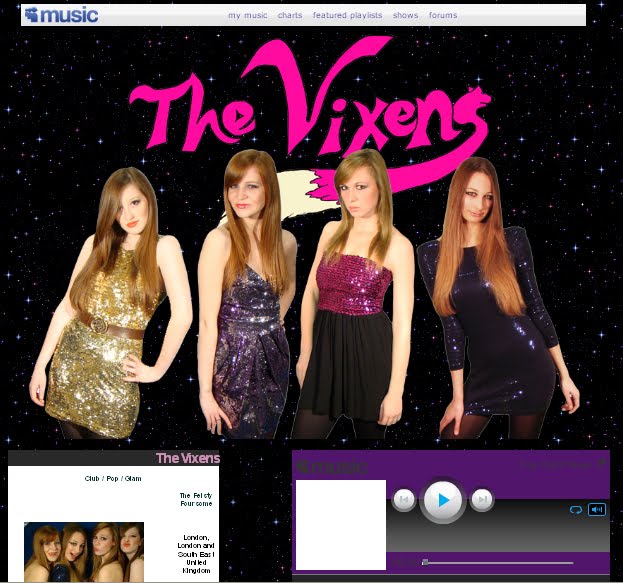
The website is on Myspace, which is a popular social networking site which is used by all the major artists. It is the key platform by which the audience can interact and engage with the band, and it allows them to see behind the scenes, with photos of the band in everyday life, and blog entries showing their thoughts. The website features the front cover, inside cover, and behind the CD shots from the album, and it promotes the album with a blog post. This shows the website and album working well to promote each other (the album has the website address on it). The website has a list of upcoming shows so that audiences can book for gigs. This also makes the band look prestigious for having booked wellknown venues such as the Brixton Academy. The website also has a bio for each of the band members, as well as a list of influences. This makes the audience feel like they know the band, and makes it more likely for them to buy the merchandise and music, and go to the gigs. At the top there is a banner, which is often used for bands, such as The Saturdays, Girls Aloud, and The Pussycat Dolls, all female bands with a similar target audience to The Vixens. On the banner is a striking photo of the band, with the band name in a logo form which will become recognisable. This is similar to The Pussycat Dolls.
The background is a twinkly night sky, which is complementary to the "glam" sub-genre, and it makes the colourful outfits stand out better. To improve the website, perhaps we could have used some animation (other than the twinkly stars) and perhaps made our own buttons for 'photos' etc as opposed to using the ones made by myspace. The website also shows the music video, and therefore links all three products together.
I believe our main products and ancillary texts are very effective at creating an appealing brand image for The Vixens.
Here are rough notes that I will develop for our recording of the evaluation.
Typical features of album covers
barcode
album title
track list (times?)
artist name
logo - recognisable typeface used for artist name
institutional information
web adress
colour scheme
strong graphic/photo of artist relative to artist/album
band image evident
booklet (inside)
continuity between back and cover
extra features - "bonus tracks" "special edition"
dual case (cheaper than digipack)
Categorise by
genre of music (rock, indie, pop)
type of appeal (mainstream/niche)
group/solo artist
audience
era
abstract/simple
male/female
record label
tone of band/artist (serious/funny)
style of artwork (photo/graphic)
debut/established artist/compilation/greatest hits (debut creates strong band image/brand - use creativity)
Functions Front cover
attracts customers to buy CD (genre target audience)
shows band/key graphic
album + artist evident
identity (stand out/distinctive)
sell institutional identity and band
get people talking about it
Back cover
track listings (inform audience of which tracks are featured)
price
legal information
website
information about record label, songs, etc
Side
reference (audience can pick it out of their collection by reading the spine)
We had to decide on a few important things before making our album cover:
who the artist is
what genre of music is on the album
the name of the album
the target audience of the album
where the album will be sold (online/shops)
These are our answers
The Vixens (Heidi, Alexa, Sammi, Sofia)
glam/pop/club/electropoprock
Glam Punch
Both genders (primarily female) aged between 14 and 30
Online and in shops
We realised that an album cover is a powerful advertising tool, and should sell the artist, complement the music, show a 'concept' for the album, and hopefully be an iconic image.
We have created an enticing idea for our album since it shows many vibrant bright colours, dynamic photos of the band, and bold yet uncluttered visuals. The cover is startling and grabs the audience with the colour contrast and interesting graphics (back cover, behind CD). Our album is not self-titled because we came up with "Glam Punch" that seemed the perfect name. It references one of our subgenres, glam, and "punch" can refer to either punching someone (grabbing their attention), or an alcoholic punch, which is something that would be associated with our band. This is continued behind the CD where there is a sketch of a martini glass, showing continuity between the different sides of the cover.
I have completed an album cover analysis chart which I will draw upon for the evaluation.
Our music video, album cover, and website are all FINISHED and now am working on the evaluation.
Have shown people the video and got comments like "i could really believe that this was professional" - 17 year old boy. and "ooooh" from others. which is positive! We're going to organise a formal screening tomorrow to our target audience to try and get some detailed feedback, hopefully some constructive stuff.
Video is on youtube, got 330 views so far, only been up for 5 days!
We had originally planned to have two-shots of us in the locket (referencing the music video), but once we had put it into the layout, we realised it didn't quite work. But i thought I'd post the photos we were going to use as they're quite nice :)
At the moment we're focusing on editing our video, and making our album cover and myspace, so haven't been blogging as much. There's some feedback on the blog about how the editing is going.
So our second shoot was on 11/11, and for some reason there was not much motivation. I think because it was the end of the day, dark and cold and rainy outside, and we all just weren't feeling great. Nevertheless, we powered through and managed to film all the footage we needed. The shoot wasn't our best, but it was OK. And the location looked GREAT (such a comfy bed too). I look forward to seeing the shots, hopefully we'll have a really strong beginning and end to our video (and middle of course...)
We've got our next shoot this afternoon to film the beginning and end sequences, which involves me in the purple dress in Holly's Mum's bedroom. Hopefully it shouldn't take TOO long, but we've got an extra tape just in case..
We have now started to properly think about what our band should be called, and since I am the main girl, with the others still playing a vital role, we thought it made sense for it to be "[someone] and the [somthing]'s".
and have come up with a bit of a short list. I was looking for a name that isn't too common, but describes a strong character. This is just initial ideas of course.
I think the best way to decide this is for all of us to pick a few names (maybe 10?), and then out of those names, pick one. Then we can start thinking about what the [somethings] will be.
I think our shoot went really well. We had made a shooting schedule, and managed to be ahead of it by about an hour and a half, so we had time at the end to experiment with different camera angles and movements. We got all the shots we wanted, and met Gok Wan, fashion guru, which was cool.
I took with my digital camera (new birthday present) so we got 100s of behind the scenes photos. We still need to shoot the beginning and end parts, which will take place in Holly's Mum's bedroom, but apart from that, I don't think we need to re-shoot anything, since we got over 2 hours of footage, and it looks pretty good.
During our shoot, at Holborn Studios, we saw Gok Wan, who was filming "How To Look Good Naked" for Maverick TV. I decided to say hi, and managed to get him to have his photo taken with us! He was really nice, he told me he went to Central School for Speech and Drama and was very chatty. Just a little highlight from our long day of filming :)
So our shoot is tomorrow. We've organised all the props we need, I think we're all taking little suitcases on wheels! I've even got a folder, with our call sheets, maps on how to get there, and schedule plus all other paperwork. We've got a lot to do, so hopefully we get it all done!
The close relationship between music tracks and visual material can be traced back to 1920s Germany and 1930s USA. Oskar Fischinger promoted music using abstract shapes, colours, movements, textures, and rhythms. Len Lye's most famous film to music was "Colourbox" in 1937.
Look at a selection of album covers (minimum of ten, CD or vinyl), maybe from your own, your parents or a friends collection, or online - the more variety in genre, style, decade etc the better. Make notes in answer to the questions below:
1. What are the typical features that an album cover has? Make a list of all the elements they have in common.
Barcode
Album Title
Artist name - logo/recognisable typeface
Track list - lengths of tracks
Legal stuff - institutional information
Web address
Colour scheme
Strong graphic/photo of the artist(s) on front cover
Band brand image very obvious
Booklet with additional info and extras
Same size - however different materials (digipack/sleeve/dual case/tin)
Continuity between back and front (colour, fonts, or sometimes totally contrasting)
Extra features - bonus tracks, "Special edition", Music video included
2. How would you categorise the covers in front of you? Are there any other ways of distinguishing between them other than generically?
Mainstream/niche
Group/solo artists
Target audience
Era
Abstract/simple concept
Male/Female
Record Label
Tone of artist(s) - serious, funny etc
Style - graphic/photography
Debut album? #1, 2 3?
Compilations
Greatest hits
3. Album covers serve many different functions. What do you think these are (ie what is their purpose?)
Front cover
Attracts customers to buy CD - attract TA
Show band/key graphic to make it stand out on the shelves and so that it is recognisable
Informs audience of who's album this is
Sell institutional identity and band image
Get people talking by having an innovative cover (word of mouth is best marketing)
Back cover
Gives information
Track listings
Track timings (sometimes)
Price sometimes - barcode
Institutional information (legal stuff)
Spine
Clear reference to Artist and Album so that audience can find it in their CD racks
If it is a Debut Album, the cover needs to establish a strong band image using creative methods that are original, eye-catching and memorable.
This is "Blood Sugar Sex Magik" (BSSM) by The Red Hot Chili Peppers (RHCP) circa 1991 (the year I was born). It was their most successful album so far, and they got their first number 1 out of it; "Give It Away".
The album cover features all four band members locking tongues (in an abstract way), which matches their rebellious and un PC image. The graphic is interesting because of the way they are positioned, and the fact it is in black, white and red. The text is split up really interestingly, and since both the band and the title of the album have four words, each word is positioned about one of the band members, with the band name in red, and the album name in grey. The roses are symbolic of sex, which is one of the words in the title of the album, and connotes the band as they are a typical rock band in that they drink, take drugs, and have lots of girls. Since this album the band hasn’t featured on any of their covers. This could be as they are getting older or the fact they are now popular enough to not have to pose on the cover.
The back cover features a barcode, the title of the album down the sides along with the band name (in the same font and colours as the front cover) and the Record Label: Warner Bros. It features Anthony Kiedis’s out stretched arm and his hand written track listing. The band’s previous album covers had all been pretty rough and forgettable. BSSM marked their biggest commercial success yet and better album artwork. The tongue design was done by Henk Schiffmacher (a.k.a Henky Penky) who has done many of the bands tattoos. The album’s photography is credited to director Gus Van Zant who also directed the Under the Bridge film clip off the album. I like the way the tracks are listed in Anthony's handwriting as it seems more personal to the band, making the audience feel like they are privileged. The back continues the colour scheme of black/white/grey/red, which are strong, masculine colours.
RHCP were quite wellknown by this point, so their audience should be able to recognise their cartoonised faces.
The website is the official website for Cascada, and as she is German, the website can be translated into either English or German. The colour scheme is purple and dark grey, and there are sparkles that follow the cursor on the banner. It has a feminine, luxurious feel to it, which goes with her image. At the top of the website is a CU of Cascada - a beauty shot. There is a music player with the option of playing 4 of her hits, as well as tour dates, her music videos, a poll about which of her songs should be on Clubland Live 3, a members area, a gallery, biography, discography, guestbook and much more. Her genre is a fusion of Europop, Eurotrance, Eurodance, R&B and House, which has similarities to our song with the "pop" and "dance" aspects.
The background to the website has a subtle pattern on the deep purple colour, which looks like the wallpaper to an exclusive club, similarly to the banner, which is black stencil on dark grey; very stylish. At the bottom of the webpage are the sponsors and her record label; Universal Music Group, Zooland Records, Vengeance, which is a conventional feature of the official website.
The website is very interactive, and there are lots of interesting things to click on.
This is Kanye West's Myspace Music page. It is surprisingly colourful considering R&B/hip-hop artists are usually associated with dark colours like black. The background is a pale duck-egg blue colour, and there are multicoloured dividers betweent he different features on the page. There are links to his official website, his blog, his videos, and the option to add him as a friend. There are music samples, videos, info about his albums and influences, and his record companies: Hip Hop Since 1978/ Def Jam/ Roc-A-Fella/ G.O.O.D.
The main graphic at the top of the page is a broken heart, which links to his album "808s & Heartbreak". Within the myspace layout, he is advertising his album for a Valentine's Day Special. "Valentine's Day is quickly approaching, and love - and heartbreak - is in the air. Not sure what to get the love of your life for Valentine's day? Check out this cool package we have put together just for this special day, featuring a brand NEW 808s and Heartbreak T-shirt!"
This is Lady Gaga's official website. IT is predominantly black, which makes her outrageous costumes stand out. There is a picture of what looks like ice/foamy diamonds, giving a luxurious and daring feel. There are links to all the major social networking sites, including her twitter feeds. There are her music videos and videos of her appearances on chat shows and Saturday Night Live. The website is crammed full of colourful boxes, making it seem a bit overcrowded.
At the top there are links to her videos, her biography, photos, tour info, ringtones, music, merchandise, a forum and more. Like the others, her record label is at the bottom, Streamline Records, and Konlive (a sponsor?).
Here are some initial ideas for shots, but I think a lot of the shots will be decided on the day so that they are spontaneous. The main thing is the look - costume, hair, make-up.
"Put your cards on the table baby” – shot of tarot cards on a table covered in fabrics
"Do I twist do I fold?” – poker table (green cloth) with poker chips and cards
"here come the drums, here come the drums” – all four of us appear in sequence in band costumes (long shot) and hit a snare drum in time to the music
-What video are you analysing, who is it by, and, if you know, who directed it? The official music video for "Viva la Vida" was directed by Hype Williams and premiered at Coldplay's official website on 1 August 2008. The video depicts the band performing against a blurry, warped version of Eugene Delacroix's painting "La Liberté guidant le peuple." The video ends with every band member crumbling to rose petals that fly into the air. Since its release, this video "Viva La Vida" has become one of the most viewed music videos on YouTube, with over 50,000,000 views worldwide.
- What genre does the music belong to and what broad characteristics of that genre does the video have? "Viva la Vida" is a song by the English alternative rock band Coldplay. It was written by all members of the band for their fourth album, Viva la Vida or Death and All His Friends (2008). The lyrics to the song contain historical and religious references, and the track is built around a repeating string section with a percussion background. These themes are often linked with the "Alternative" genre so there are not that many conventions, except for the videos being a bit abstract.
What is the relationship between lyrics and visuals? - Work through the song and identify ways in which the lyrics are illustrated or amplified or even contradicted by the visuals. Pick out some specific examples to back up your argument. At 0:40 the lyrics are "I used to roll the dice, feel the fear in my enemies eyes" and Chris Martin (the lead singer) used his hands to mime the lyrics - he rolls his hands over each other for the line "roll the dice" and points to his eyes for "enemies eyes". This is illustration. For the lines "Listen as the crowd would sing 'Now the old king is dead! Long live the king!'" he uses a hand gesture to mime shouting, as if he were the crowd, thus illustrating. At 1:00, the lyrics are "Next the walls were closed on me", and he amplifies this by miming his hand being a wall, closing in on him (going towards his face). This is amplification in my opinion because he could have used an actual wall, but instead used his hands. This could be argued to be illustration, so maybe it is a combination of the two. "I hear Jerusalem bells a ringing" is illustrated by a CU of a large bell being struck. "It was the wicked and wild wind" (1:50) is amplified because it shows a low angle wide shot of the whole band, with firey clouds in the background. This suggests "wicked and wild wind" but is not literal, so amplifies it, furthering the abstract theme of the Alternative genre. At 2:25, "Roman Cavalry choirs are singing" is contradicted because the video just shows the guitarists, and Chris Martin striking his hand in time to the beat. This has nothing to do with Roman choirs, therefore contradicts it.
What is the relationship between music and visuals? (give examples to support your points)
- Does the video cut to the beat? Yes, one part in particular, from 3:02 - 3:05, where the editing pace picks up and cuts to each beat. In general, it does sometimes, for example parts with a CU on the drum beating to the music, however usually the shots change in their own time.
- Are solo instrumental bits illustrated by the video? Yes, often. There are CUs on the lead singer, the bell, the drum, the bass guitarist, the guitarist, the drummer, violinist, cellist, keyboard. It makes up the majority of the video, excluding the performance from Chris Martin.
- Does the video change pace with the music? Yes, as I mentionned before, at 3:02 the editing pace speeds up to go with the bassline that has become more prominent. Earlier, it was slower, which reflected the song.
Are there close-ups of the artist and star image motifs? - How is the record company looking to sell this track? There are many close-ups of the lead singer Chris Martin, and since this song is on Coldplay's fourth album, he is a familiar face. The record company originally released the video on Coldplay's official website, before releasing it on YouTube, so it was originally targeting their huge fan base that already exists. The track was for download only at first, and became the sixth song in digital history to reach the 4 million mark in paid downloads.
- What image of the artist/band is being offered? The band are portrayed as being very musical (they are always shown with their instruments except at the very end), and as contradicting the stereotype of musicians. Chris Martin doesn't smoke or drink alcohol, he is vegetarian, and practices Yoga. He is spiritual, and believes in God, therefore the lyrics of the song and the video itself reflect that. You can see the bands passion for music without them having to lead crazy lives.
- How does this video relate to previous videos by the artist? http://www.youtube.com/watch?v=skUJ-B6oVDQ Their video for "Fix You" shows only Chris Martin for the first half, until he joins his band on stage at an arena during the climax of the song. It shows the massive crowd, but the editing is still not really cut to the music. It is slow-paced until the climax where Chris Martin is running (during the instrumental bridge) to the stadium. There is the same feel, although this one is less abstract than "Viva La Vida".
- Are there motifs which have been used previously? Or does this video represent a change of image? The only real motif there is, is Chris Martin looking into the camera a lot, and the band being shown at some point. There is not really a narrative, there is a journey, but that seems more like a concept as opposed to a parallel narrative, considering the journey turns into the performance.
Is there reference to the notion of looking? (give examples and consider why these features have been chosen)
- Do you get the sense that the artist is on sexual display or that other people in the video are used in this way? No, Coldplay's image is not sexual, it is more about passion for music. The band are not sexualised. The only notion of sexuality is at the end when the band members crumble to rose petals, which are a signifier of sex, romance and relationships.
- Does camerawork, costume, dance or something else imply sexualised display? No, they are dressed casually; jeans, t-shirts, jackets. They don't dance, and the camerawork doesn't show them to be flirting with the camera, simply addressing the camera to get across the message of the lyrics.
- Are there other references to 'looking' such as screens within screens or binoculars, cameras, etc? The only reference to 'looking' is the way the camera angles are quite canted, at quirky angles, suggesting that they don't know they are being watched (eg 1:24), but this is cross-cut with shots of them looking straight at the camera.
Are there intertextual references?
- Do these relate to other music videos, to aspects of the star's image or to completely seperate texts such as TV programmes or films? How are they used? The background to the video is a blurry, warped version of Eugene Delacroix's painting "La Liberté guidant le peuple." The painting is below on the right, and the album cover is on the left. This is strong intertextuality since it references the lyrics "My missionaries in a foreign field", the painting is used as the background to the music video, and is the album cover.
Is the music video performance-based, narrative-based or concept-based? - How much of each? As stated earlier, there is no narrative, it is just performance and concept. The concept centres around the performance, in particular the strong physical performance from the lead singer. His gestures and facial expressions make up for a lack of location variety, and matches the song well.
In conclusion, I really like this video, and I LOVE the song. It is relaxing yet with a good beat. And apparently, 52 million others agree with me...
NEEDS SATISFY – individual needs for individual people. Satisfy taste for music
FEATURES – music, artist, lyrics (optional), video, narrative or performance, illustrating, amplifying or disjuncture of lyrics
HOW & WHERE – whenever and wherever with technology nowadays
LOOK LIKE – a music video, look of band
EXPERIENCE – however they want with technology nowadays
CALLED & BRANDED – individual to brand
PLACE
WHERE – music on internet, on television, through word of mouth, in clubs. Promotional product sprite, in shops
PRICE
PRICE SENSITIVE – music targeted mostly and teenagers, 20+, students so can’t cost too much because won’t want to pay it, free downloads to bring in audience
PROMOTION
Music and Coca-cola – synergy. Sprite endorsing new artists to target music fans. Webisodes is interactive which appeals to young market, young new artists – relates
REACH - Web – youtube
WHERE & WHEN – internet, whenever, very interactive and therefore personal
ADVERTISING & PR – organising music reality show and advertising online (frukt.com)
TECHNOLOGY – yes, available on internet, download webisodes available on new technology
BEST TIME TO PROMOTE – start of summer, summer no 1, February – love songs, Christmas – Christmas no 1, just before major music award shows to get coverage and possibility of winning
Trojan condoms and Cobra Starship music video
Promote safe sex along with music
Synergy band featured in condom advert
Controversial with CBS and Fox
1. Summarising in your own words what the 4Ps of music marketing are. Use the following categories:
a) What band/artist related products can audiences buy?
CD's, merchandise, Posters, T-Shirts
b) Where can audiences buy/listen to music/merchandise/hardware?
Shops (HMV etc), Online (Amazon, play.com etc), Downloads (Itunes etc). Merchandise can often be purchased from HMv and other music stores, or stands withing other shops e.g. topshop often have band t-shirts in a seperate section of the shop.
c) Give 2 or 3 examples of paid-for/subscription based and free products.
Free Products:
free music downloads (often as a taster before the album)
free episodes to watch online
free tickets to a gig when you pre order a CD.
Paid for/subscription Products:
CD'S
Downloads
music magazines (paid for and often subscription)
Merchandise
Subscriptions to band websites (updates via email)
d) List between 5 and 10 examples of creative music marketing strategies (including at least 3 internet based examples).
Lily Allen’ssingle The Fear is being promoted via a viral music game. The instant gratification of this type of game makes it inherently viral. They are potentially reaching a new audience who are not listening to the radio or reading the music press.
Adidasare using the famous artists and sports stars to promote their product to specific audience by showing adverts on television which has a large audience, getting more coverage of both the product and the stars. Yes, on TV between the correct shows to reach the correct audiences.
Jamie Cullumlaunched ‘The Advent Cullumdar’ on 1st December which houses £20,000 worth of Christmas gifts behind its virtual windows, including AC/DC tickets, John Legend concert tickets, 10 CDs from Universal and a Nokia Comes With Music phone.
Samsung:Bebo and Samsung are teaming up to promote their new Beat phone over the internet in a online series. It will be interactive and allow the audience to interact through blogs, upload track reviews, share music news and win chances to appear in episodes. They will also be trying to find a co-presenter for the show and are also offering live performances from White Lies and The Maccabees to promote the series
Lenka's song The Show was the iTunes free download of the week in September 2008, which promoted her whole self-titled album, pushing up sales
2. Who is frukt uk and what is their mission statement/company ethos?
Frukt UK is an agency specialising in music marketin.
"We’re all about music and are really very fond of it. Music colours people’s everyday lives. It’s found in the mundane and the exalted. It moves us all. And it’s thriving. We help brands access the passion and the communities, the lifestyle and the artists. Music is a vast cultural space - it's flexible, it's multi-channel, it's live and digital, it unites gender, race and age and it defines the spirit of generations.You just need to know how to use it. "
"We bring communication ideas to life through music and aim to produce work that is creatively bold and distinct. Either we develop the central idea ourselves and bring it to life with our team of on and offline activation specialists, or work collaboratively with other agencies, using music to make their ideas shine."
Looking at Elvis Costello's "Pump It Up" video which samples the riff used in our song, I've seen some aspects that could work quite well in our video. He dances crazily, and they play instruments in a really stylised way. If we wanted to do this, I have many instruments in case we need props.
As a group, we have chosen "Voodoo Child" by Rogue Traders, which makes me very happy as it was one of my suggestions and I think it will work really well with our group look and ideas.
We're currently working on a treatment, which is being developed on the group blog.
My final choice out of the songs I've listened to is "Alive" by Natalie Bassingthwaighte. This song sounds like a mix of Pink, Rihanna, and Britney Spears, three female superstars, combining RnB, Pop, Rock, Punk, Dance-Pop and Electro-Pop.
Natalie Bassingthwaighte (born 1 September 1975) is an Australian actress, singer and television personality. She is the former lead vocalist of electro-pop band Rogue Traders, author of a book for teenage girls and host of "So You Think You Can Dance Australia". She is perhaps best known for the role of Izzy Hoyland on the "Neighbours" from 2003 to 2007 (which I used to watch), which gained her nominations for the TV Week Gold Logie. Her debut album "1000 Stars" debuted at number 1 on the March 1, 2009.
Lyrics
Alive, alive, alive, alive
Never thought the day would come when I'd see My reflection smiling right back at me It's been a while since I've been happy Not sure, that I'm ready I never planned on letting love in Didn't wanna go back there again
But maybe I could (maybe I should) Take a, take a chance on you
Tonight, I'm lost in the music and lights I don't wanna let go but I might If it's right Tonight, tonight, tonight, tonight Is this real? Cause this heart is just startin' to heal And you're so close to makin' me feel (me feel) Alive, alive, alive, alive
I didn't ever think that I'd be given Everythin' that I was missing It's like somebody out there's listening Still not sure, that I'm ready But maybe I could (maybe I should) Take a, take a chance on you
Tonight, I'm lost in the music and lights I don't wanna let go but I might If it's right Tonight, tonight, tonight, tonight Is this real? Cause this heart is just startin' to heal And you're so close to makin' me feel (me feel) Alive, alive, alive, alive
You're makin' me feel, alive, alive Alive, alive, alive, alive
I don't know if it's love again But I'm closer than I've ever been You're makin' me wanna let you in (wanna let you in) I can feel your energy I can't explain the chemistry All the signs are telling me Take a chance on you
Tonight, I'm lost in the music and lights I don't wanna let go but I might If it's right Tonight, tonight, tonight, tonight Is this real? Cause this heart is just startin' to heal And you're so close to makin' me feel (me feel) Alive, alive, alive, alive
Tonight, I'm lost in the music and lights I don't wanna let go but I might If it's right Tonight, tonight, tonight, tonight Is this real? Cause this heart is just startin' to heal And you're so close to makin' me feel (me feel) Alive, alive, alive, alive
For the idea for the visuals, I would want a mixture of performance and narrative. I really like Radiohead video for "Just" as the narrative is original, funny, and interesting, giving it great playability.
I want something like that for our music video, so that it stands out.
Looking at the lyrics for "Alive", it seems that she has recently broken up with someone and got her heart broken, "I never planned on letting love in. Didn't wanna go back there again", and now is hesitant to let herself fall for this new guy. It almost seems as though she is getting ready for a date with this guy, while remembering how badly she got hurt before, and maybe having doubts about the new guy. Or perhaps she is at a club/party with the guy in a bit of a daze, "lost in the music and lights", still debating whether or not to continue with this guy.
One idea for the narrative is that the main girl is writing a list of things that are missing in her life, things like "good job", "nice appartment", "great friends" that are crossed off, and "loving boyfriend" which she is pondering over, "It's like somebody out there's listening" to what she wants. http://www.youtube.com/watch?v=Wh86uSsux1M
This video is interesting as the main guy sends messages to strangers using pigeons/doves. The idea of sending/receiving little messages could be used in our video, not sure how yet, but I'm sure we could incorporate it somehow.
I recently saw the film "500 Days Of Summer" in which they used a split-screen technique, showing the man's ideal situation, and the reality of the situation. In his perfect version, he went to his ex's party and ended up talking to her all night and kissing her. In the real version, he barely spoke to her, and noticed an engagement ring on her finger. I would like to use this technique in my music video as I think it would fit with this song.
Perhaps for this song, there could be either a split screen or cross-cutting (with a bright heavenly lighting effect in the expectation sequence) between the girl calling the guy, going out with him on romantic dates, and being happy, given jewellery or flowers in a park by him. This would be cross-cut with the reality which could be that she ignores his calls, stops seeing him for fear of getting her heart broken, and continuing to lead a slightly empty life, and then later, after time has passed, she sees him with his new girlfriend at the park in which he gave her the jewellery in her dream-situation. I can imagine a park filled with autumn leaves (as it is currently September and the leaves are starting to fall) which would look really romantic, but instead she is left alone. This could also be cross-cut with her at a bar on her own, or at home with a glass of wine. The performance part of this could be her at a club/party trying to get over him, or in her house, or in the street with her friends, dancing while singing it. I think it is a strong, catchy song, and there is plenty of scope for interesting scenarios and effects such as playing footage backwards and forwards, or using grading effects that enhance certain colours. Obviously if my group decided to do this song, we could brainstorm loads of ideas and choose the best ones, but for now, these are my initial ideas.
I also like "Voodoo Child" by Rogue Traders (with Natalie Bassingthwaighte) as it is similar to "Alive".
This is "You Are What You Love" by Jenny Lewis, which despite being not that upbeat, is quite nice... I could imagine a cute narrative, but that's not really what we're going for..
This is called "Deceptacon" by Le Tigre. It's really weird, quite funny, and i love the funny dancing in this video (which i think is the official one..? But it's really bad quality..) Thought we could maybe do some kind of dance thing like this for a short time in a song if it fitted the genre. Because it creates comedy and suits the beat.
This is "The Journey" by Delores O'Riordan which I stumbled upon. It's quite uplifting, with a good beat, and there are a few female voices. I quite like it, however I think the visuals that it conjures up are of sweeping landscapes, something which we can't really do.. Obviously we could try and think up something else, but this is a possibility.
"When We Were Young" by the same artist. I like this; it's girly and edgy at the same time, with a catchy chorus and good strong bassline and beat. I could imagine some funky costumes and hair for this, and it's not very well known as I think the artist is Irish..
My name is Laura Allen and I'm doing A2 Media Studies (as well as Drama and French) at The Latymer School. Here is my individual blog on the Music Industry... Enjoy! xx