We made a music video for the song "Voodoo Child", an official myspace page for the band, and an album cover to promote "Glam Punch", our debut album.
How effective is the combination of your main product and ancillary texts?
The music video was made to promote the single "Voodoo Child" and I think it does this very well. I have shown the video to several people, different ages and genders, and they have all enjoyed it, even if the genre of song isn't their usual taste. The visuals are interesting and the video is humorous as well as professional-looking. It is also a bit raunchy, which appeals to the male audience. I think it could be improved by potentially using more props. We had originally thought of using tarot cards since the lyrics say "tell me my future" and we thought it could be a nice motif, but when it came to shooting, we didn't get around to it, and we realised that we didn't actually have any tarot cards. So perhaps some extra props could have made it more varied. However, even without that, I think the video worked well to promote the band and the album because the song itself is catchy, and the video is very striking and memorable.
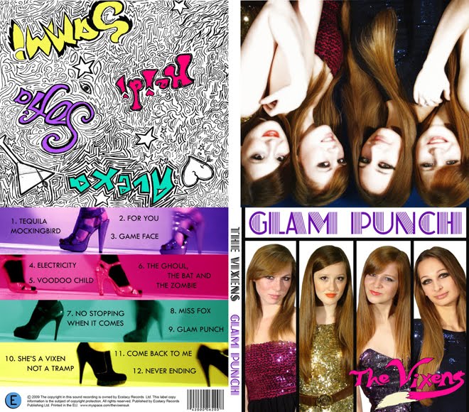
The album cover works as packaging tool for the album, whether it is bought instore or online, because with iPods, album artwork is displayed, so the front cover will at least be seen on iTunes or the official website. The album makes a lot of money for the artist, and the music video works well to entice people into buying the album. The fact that the album uses a still from the music video shows good continuity between them, and any people who have watched the music video will be reassured by seeing this powerful image on the back of the album cover. Looking back at the album cover, although I like the front cover as the pictures stand out well and it is clearly stylised with columns, I think perhaps it would have worked better to use the photo from the inside cover for the front cover because we look more like a group as we are closer together and interacting. The 'doodle' behind the CD links well to the back cover of the album because it uses the same four colours for our names as it does for the bands of colour on the back. These colours originally came from the music video, showing that the album cover and the music video work well together. I think the album cover is effective in promoting the album because it is interesting with lots to look at, and yet is not cluttered. It has the information necessary, and gives a trendy, vibrant, young image, which is what The Vixens are all about.
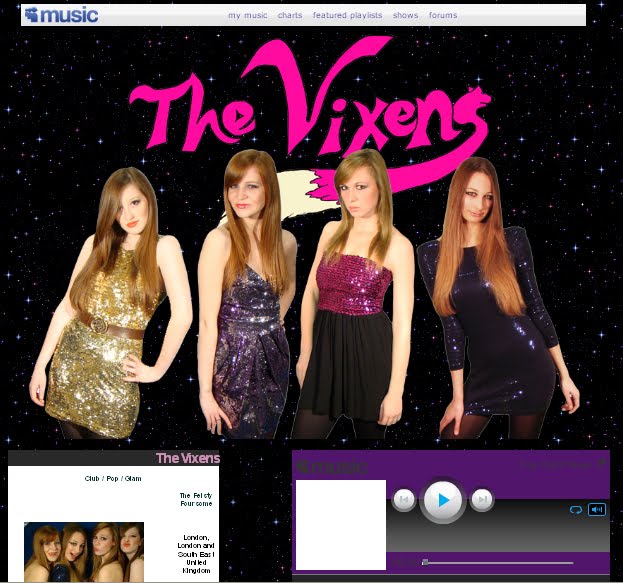
The website is on Myspace, which is a popular social networking site which is used by all the major artists. It is the key platform by which the audience can interact and engage with the band, and it allows them to see behind the scenes, with photos of the band in everyday life, and blog entries showing their thoughts. The website features the front cover, inside cover, and behind the CD shots from the album, and it promotes the album with a blog post. This shows the website and album working well to promote each other (the album has the website address on it). The website has a list of upcoming shows so that audiences can book for gigs. This also makes the band look prestigious for having booked wellknown venues such as the Brixton Academy. The website also has a bio for each of the band members, as well as a list of influences. This makes the audience feel like they know the band, and makes it more likely for them to buy the merchandise and music, and go to the gigs. At the top there is a banner, which is often used for bands, such as The Saturdays, Girls Aloud, and The Pussycat Dolls, all female bands with a similar target audience to The Vixens. On the banner is a striking photo of the band, with the band name in a logo form which will become recognisable. This is similar to The Pussycat Dolls.

The background is a twinkly night sky, which is complementary to the "glam" sub-genre, and it makes the colourful outfits stand out better. To improve the website, perhaps we could have used some animation (other than the twinkly stars) and perhaps made our own buttons for 'photos' etc as opposed to using the ones made by myspace. The website also shows the music video, and therefore links all three products together.
I believe our main products and ancillary texts are very effective at creating an appealing brand image for The Vixens.

0 comments:
Post a Comment