During our shoot, at Holborn Studios, we saw Gok Wan, who was filming "How To Look Good Naked" for Maverick TV. I decided to say hi, and managed to get him to have his photo taken with us! He was really nice, he told me he went to Central School for Speech and Drama and was very chatty. Just a little highlight from our long day of filming :)

Saturday, October 31, 2009
We met GOK WAN!
Posted by LATYMERMEDIA at 6:40 AM 0 comments
Labels: Gok Wan, Production
Tuesday, October 27, 2009
Shoot!
So our shoot is tomorrow. We've organised all the props we need, I think we're all taking little suitcases on wheels! I've even got a folder, with our call sheets, maps on how to get there, and schedule plus all other paperwork. We've got a lot to do, so hopefully we get it all done!
Posted by LATYMERMEDIA at 9:41 AM 0 comments
Labels: Production, shoot
Monday, October 12, 2009
DYM MYSPACE FEEDBACK
Confident Myspace research, Laura.
Posted by LATYMERMEDIA at 3:03 AM 0 comments
Thursday, October 8, 2009
Summary Of Music Video History
Posted by LATYMERMEDIA at 3:44 AM 0 comments
Labels: Music Video History, research
Wednesday, October 7, 2009
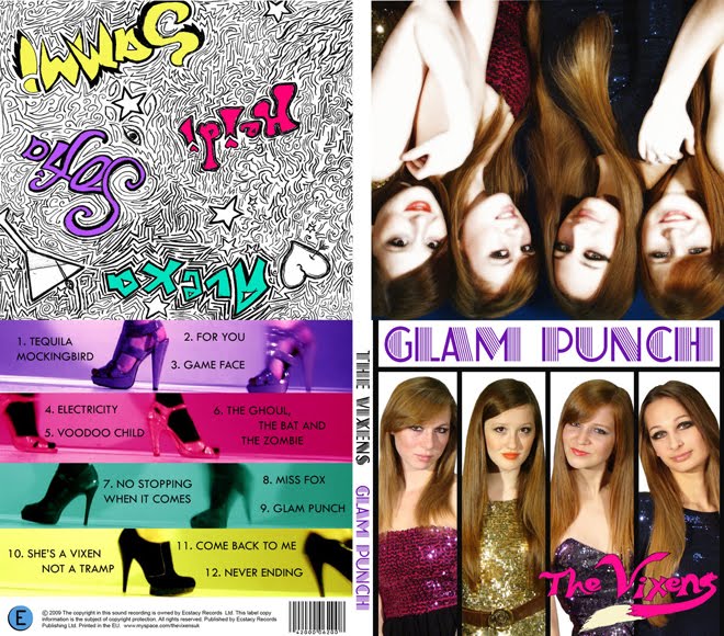
Album Cover conventions
Look at a selection of album covers (minimum of ten, CD or vinyl), maybe from your own, your parents or a friends collection, or online - the more variety in genre, style, decade etc the better. Make notes in answer to the questions below:
1. What are the typical features that an album cover has? Make a list of all the elements they have in common.
- Barcode
- Album Title
- Artist name - logo/recognisable typeface
- Track list - lengths of tracks
- Legal stuff - institutional information
- Web address
- Colour scheme
- Strong graphic/photo of the artist(s) on front cover
- Band brand image very obvious
- Booklet with additional info and extras
- Same size - however different materials (digipack/sleeve/dual case/tin)
- Continuity between back and front (colour, fonts, or sometimes totally contrasting)
- Extra features - bonus tracks, "Special edition", Music video included
2. How would you categorise the covers in front of you? Are there any other ways of distinguishing between them other than generically?
- Mainstream/niche
- Group/solo artists
- Target audience
- Era
- Abstract/simple concept
- Male/Female
- Record Label
- Tone of artist(s) - serious, funny etc
- Style - graphic/photography
- Debut album? #1, 2 3?
- Compilations
- Greatest hits
3. Album covers serve many different functions. What do you think these are (ie what is their purpose?)
Front cover
- Attracts customers to buy CD - attract TA
- Show band/key graphic to make it stand out on the shelves and so that it is recognisable
- Informs audience of who's album this is
- Sell institutional identity and band image
- Get people talking by having an innovative cover (word of mouth is best marketing)
Back cover
- Gives information
- Track listings
- Track timings (sometimes)
- Price sometimes - barcode
- Institutional information (legal stuff)
Spine
- Clear reference to Artist and Album so that audience can find it in their CD racks
If it is a Debut Album, the cover needs to establish a strong band image using creative methods that are original, eye-catching and memorable.
Posted by LATYMERMEDIA at 12:58 AM 0 comments
Labels: album cover analysis, research
Monday, October 5, 2009
Album Cover research
This is "Blood Sugar Sex Magik" (BSSM) by The Red Hot Chili Peppers (RHCP) circa 1991 (the year I was born).
It was their most successful album so far, and they got their first number 1 out of it; "Give It Away".
The album cover features all four band members locking tongues (in an abstract way), which matches their rebellious and un PC image. The graphic is interesting because of the way they are positioned, and the fact it is in black, white and red. The text is split up really interestingly, and since both the band and the title of the album have four words, each word is positioned about one of the band members, with the band name in red, and the album name in grey. The roses are symbolic of sex, which is one of the words in the title of the album, and connotes the band as they are a typical rock band in that they drink, take drugs, and have lots of girls. Since this album the band hasn’t featured on any of their covers. This could be as they are getting older or the fact they are now popular enough to not have to pose on the cover.
The back cover features a barcode, the title of the album down the sides along with the band name (in the same font and colours as the front cover) and the Record Label: Warner Bros. It features Anthony Kiedis’s out stretched arm and his hand written track listing. The band’s previous album covers had all been pretty rough and forgettable. BSSM marked their biggest commercial success yet and better album artwork. The tongue design was done by Henk Schiffmacher (a.k.a Henky Penky) who has done many of the bands tattoos. The album’s photography is credited to director Gus Van Zant who also directed the Under the Bridge film clip off the album. I like the way the tracks are listed in Anthony's handwriting as it seems more personal to the band, making the audience feel like they are privileged. The back continues the colour scheme of black/white/grey/red, which are strong, masculine colours.
RHCP were quite wellknown by this point, so their audience should be able to recognise their cartoonised faces.
Posted by LATYMERMEDIA at 3:50 AM 0 comments
Labels: album cover analysis, blk, research
DYM

http://www.cascada-music.de/
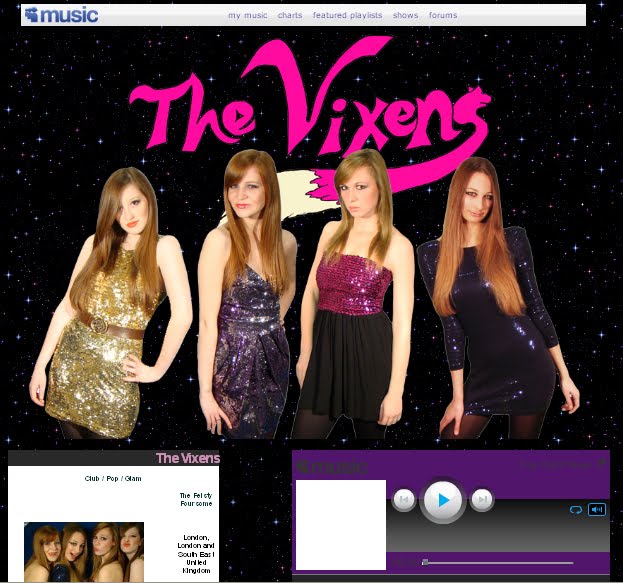
The website is the official website for Cascada, and as she is German, the website can be translated into either English or German. The colour scheme is purple and dark grey, and there are sparkles that follow the cursor on the banner. It has a feminine, luxurious feel to it, which goes with her image. At the top of the website is a CU of Cascada - a beauty shot. There is a music player with the option of playing 4 of her hits, as well as tour dates, her music videos, a poll about which of her songs should be on Clubland Live 3, a members area, a gallery, biography, discography, guestbook and much more. Her genre is a fusion of Europop, Eurotrance, Eurodance, R&B and House, which has similarities to our song with the "pop" and "dance" aspects.
The background to the website has a subtle pattern on the deep purple colour, which looks like the wallpaper to an exclusive club, similarly to the banner, which is black stencil on dark grey; very stylish. At the bottom of the webpage are the sponsors and her record label; Universal Music Group, Zooland Records, Vengeance, which is a conventional feature of the official website.
The website is very interactive, and there are lots of interesting things to click on.

http://www.myspace.com/kanyewest
This is Kanye West's Myspace Music page. It is surprisingly colourful considering R&B/hip-hop artists are usually associated with dark colours like black. The background is a pale duck-egg blue colour, and there are multicoloured dividers betweent he different features on the page. There are links to his official website, his blog, his videos, and the option to add him as a friend. There are music samples, videos, info about his albums and influences, and his record companies: Hip Hop Since 1978/ Def Jam/ Roc-A-Fella/ G.O.O.D.
The main graphic at the top of the page is a broken heart, which links to his album "808s & Heartbreak". Within the myspace layout, he is advertising his album for a Valentine's Day Special. "Valentine's Day is quickly approaching, and love - and heartbreak - is in the air. Not sure what to get the love of your life for Valentine's day? Check out this cool package we have put together just for this special day, featuring a brand NEW 808s and Heartbreak T-shirt!"
Lady Gaga
http://www.ladygaga.com/default.aspx
This is Lady Gaga's official website. IT is predominantly black, which makes her outrageous costumes stand out. There is a picture of what looks like ice/foamy diamonds, giving a luxurious and daring feel. There are links to all the major social networking sites, including her twitter feeds. There are her music videos and videos of her appearances on chat shows and Saturday Night Live. The website is crammed full of colourful boxes, making it seem a bit overcrowded.
At the top there are links to her videos, her biography, photos, tour info, ringtones, music, merchandise, a forum and more. Like the others, her record label is at the bottom, Streamline Records, and Konlive (a sponsor?).
Posted by LATYMERMEDIA at 2:25 AM 0 comments
Labels: DYM, research, website analysis
Sunday, October 4, 2009
Shot list
Here are some initial ideas for shots, but I think a lot of the shots will be decided on the day so that they are spontaneous. The main thing is the look - costume, hair, make-up.
- "Put your cards on the table baby” – shot of tarot cards on a table covered in fabrics
- "Do I twist do I fold?” – poker table (green cloth) with poker chips and cards
- "here come the drums, here come the drums” – all four of us appear in sequence in band costumes (long shot) and hit a snare drum in time to the music
- "I’m coming undone” – hair unravelling, corset undoing (slo-mo)
- "don’t say maybe maybe” – CU on lips, each girl says a different word
- "feel your poison running through me baby” – canted angle of girls moving slowly, acting sort of drunk
- "you play me like a puppet baby” – girls being held up by strings like puppets
- "baby baby baby” – dance routine with girls, in time with music, fairly simple
Posted by LATYMERMEDIA at 9:29 AM 0 comments


