CLICK HERE FOR BLOGGER TEMPLATES AND MYSPACE LAYOUTS »

Final Music Video

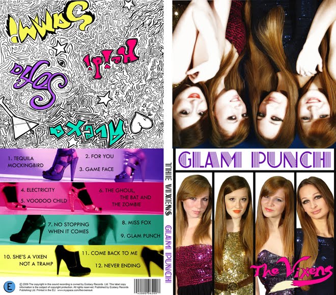
Final Album Cover

Final Album Cover

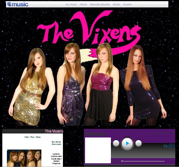
Click On The Picture To Go To Our Official Myspace Page

Showing posts with label album cover analysis. Show all posts

Wednesday, October 7, 2009

Album Cover conventions

Look at a selection of album covers (minimum of ten, CD or vinyl), maybe from your own, your parents or a friends collection, or online - the more variety in genre, style, decade etc the better. Make notes in answer to the questions below:


1. What are the typical features that an album cover has? Make a list of all the elements they have in common.

  • Barcode
  • Album Title
  • Artist name - logo/recognisable typeface
  • Track list - lengths of tracks
  • Legal stuff - institutional information
  • Web address
  • Colour scheme
  • Strong graphic/photo of the artist(s) on front cover
  • Band brand image very obvious
  • Booklet with additional info and extras
  • Same size - however different materials (digipack/sleeve/dual case/tin)
  • Continuity between back and front (colour, fonts, or sometimes totally contrasting)
  • Extra features - bonus tracks, "Special edition", Music video included

2. How would you categorise the covers in front of you? Are there any other ways of distinguishing between them other than generically?

  • Mainstream/niche
  • Group/solo artists
  • Target audience
  • Era
  • Abstract/simple concept
  • Male/Female
  • Record Label
  • Tone of artist(s) - serious, funny etc
  • Style - graphic/photography
  • Debut album? #1, 2 3?
  • Compilations
  • Greatest hits

3. Album covers serve many different functions. What do you think these are (ie what is their purpose?)

Front cover

  • Attracts customers to buy CD - attract TA
  • Show band/key graphic to make it stand out on the shelves and so that it is recognisable
  • Informs audience of who's album this is
  • Sell institutional identity and band image
  • Get people talking by having an innovative cover (word of mouth is best marketing)

Back cover

  • Gives information
  • Track listings
  • Track timings (sometimes)
  • Price sometimes - barcode
  • Institutional information (legal stuff)

Spine

  • Clear reference to Artist and Album so that audience can find it in their CD racks

If it is a Debut Album, the cover needs to establish a strong band image using creative methods that are original, eye-catching and memorable.

Monday, October 5, 2009

Album Cover research

This is "Blood Sugar Sex Magik" (BSSM) by The Red Hot Chili Peppers (RHCP) circa 1991 (the year I was born).
It was their most successful album so far, and they got their first number 1 out of it; "Give It Away".


The album cover features all four band members locking tongues (in an abstract way), which matches their rebellious and un PC image. The graphic is interesting because of the way they are positioned, and the fact it is in black, white and red. The text is split up really interestingly, and since both the band and the title of the album have four words, each word is positioned about one of the band members, with the band name in red, and the album name in grey. The roses are symbolic of sex, which is one of the words in the title of the album, and connotes the band as they are a typical rock band in that they drink, take drugs, and have lots of girls. Since this album the band hasn’t featured on any of their covers. This could be as they are getting older or the fact they are now popular enough to not have to pose on the cover.


The back cover features a barcode, the title of the album down the sides along with the band name (in the same font and colours as the front cover) and the Record Label: Warner Bros. It features Anthony Kiedis’s out stretched arm and his hand written track listing. The band’s previous album covers had all been pretty rough and forgettable. BSSM marked their biggest commercial success yet and better album artwork. The tongue design was done by Henk Schiffmacher (a.k.a Henky Penky) who has done many of the bands tattoos. The album’s photography is credited to director Gus Van Zant who also directed the Under the Bridge film clip off the album. I like the way the tracks are listed in Anthony's handwriting as it seems more personal to the band, making the audience feel like they are privileged. The back continues the colour scheme of black/white/grey/red, which are strong, masculine colours.

RHCP were quite wellknown by this point, so their audience should be able to recognise their cartoonised faces.