Dear Moderator,
First of all, thank you for taking the time to look through my blogs, I've tried to make them as interesting as possible! On the right you will see a bit about me, a link to my group blog "The Vixens" and links to my group members' blogs. There is also a link back to the teachers central blog "Latymer Music Video 2009" which has links to all the other students' group and individual blogs.
My individual blog consists mainly of research and inital ideas, because once we decided on our song, the rest of the planning and production work was done on the group blog. I have also included reflections on our shoots, and in-depth analysis of other music videos as part of my theory learning. My Evaluation answers are in video form, with short text accompanying them. You can also find them on my group blog. All of my posts are labelled and you can locate them in the Labels List on the right hand side.
On my group blog you will find posts labelled "research", "planning" and "production" among others, which can be found easily using the Labels List on the right hand side. It also says who did which post, which is useful for marking purposes I'm sure!
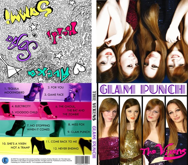
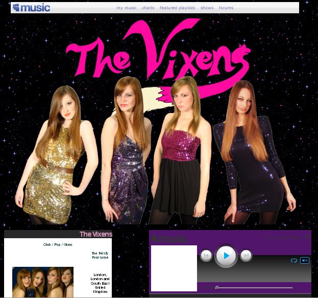
We chose to produce an album cover and a website homepage as our ancillary texts to our music video, which are at the top of both my individual blog and group blog.
I've tried to make it simple to navigate my blogs; the posts are organised in chronological order, with the most recent posts being at the top. This project ran from June 2009 - December 2009, and if you want to, you can navigate by month using the Blog Archive on the right hand side.
Regards
Laura Allen 5015
Sunday, January 24, 2010
Posted by LATYMERMEDIA at 1:41 PM 0 comments
Labels: moderator
Thursday, December 17, 2009
Overall evaluation of the evaluation
I think we pretty much said it all in our video evaluation. We managed to be concise, and tried not to ramble too much, which was good because I know we could've talked for HOURS about our project. At times we spoke over each other a bit, but it just showed how passionate we are about our work. We used clipboards, cue cards, and each other for information and prompting, and successfully used examples (real albums, Youtube clips from real music videos, clips from our music video, real bands' myspace pages) and I think we presented our project well. We divided the questions up so that we could work in more detail on the answers, and so each of us led parts of the questions. In spite of this, we all contributed to all questions, and had more of a conversation about the answers as opposed to just listing them.
I've really enjoyed working on this project with my lovely group, and the fact we are all so proud of our work must be a testement to how good it is!
Goodbye Vixens!
Posted by LATYMERMEDIA at 7:38 AM 0 comments
Labels: evaluation
Wednesday, December 16, 2009
Q4 - How did you use new media technologies in the construction and research, planning and evaluation stages?
Holly led this question.
Posted by LATYMERMEDIA at 1:14 PM 0 comments
Labels: evaluation, Q4
Q3 - What have you learnt from your audience feedback?
Amelia led this question.
I posted these on the group blog too, a sample of our questionnaires:
questionaire 1
questionaire 2
questionaire 3
This is a link to a post I did on the group blog, which is great feedback from an ex-Latymer media student. http://latymermusiccharlotteameliahollylaura.blogspot.com/2009/12/feedback.html
Posted by LATYMERMEDIA at 1:13 PM 0 comments
Labels: evaluation, Q3
Q2 - How effective is the combination of your main product and ancillary texts?
I led this question, which mainly talks about branding.
All of our products are at the top of my blog, so scroll up if you want to look at them (click on the third picture to go straight to the website).
We reference The Saturdays' myspace page http://www.myspace.com/thesaturdays and Girls Aloud's page http://www.myspace.com/girlsaloud
Here is the Pussy Cat Dolls logo that we talked about.
It would've been a nice idea to create a marketing campaign as there is so much opportunity online with viral marketing campaigns, so if we had more time, we would've liked to have experimented with that.
Posted by LATYMERMEDIA at 2:44 AM 0 comments
Labels: evaluation, Q2
Q1 - In what ways does your media product use, develop or challenge forms and conventions of real media products?
Here is part 1 of our answer to Question 1. This focuses on the analysis of the Music Video using Goodwin and Vernallis, which is led by Amelia and Holly.
The clips we referenced on Youtube are:
Katy Perry - "Hot 'n' Cold" http://www.youtube.com/watch?v=y-LhyAVzDBI
Beyonce - "Single Ladies" http://www.youtube.com/watch?v=FyHVQT8aIBM
Lady Gaga - "Bad Romance" http://www.youtube.com/watch?v=qrO4YZeyl0I
We split Q1 equally, but I had already started analysing the music video, so here is my analysis chart:

Here is the second part of Q1. This focuses on the analysis of the Album Cover and the Myspace. I led the Album Cover analysis, and Charlotte led the Myspace analysis.
I wanted to add to the Album Cover analysis by talking about our branding and how it comes across. We’re a bit different to other girl bands because we all look similar as opposed to having “the blonde one” “the redhead” etc. This is unusual because it means that perhaps we, as individuals, are less recognisable, but for the band image it is quite good, since whenever someone sees a girl who looks like one of us 4, they will think of The Vixens. It makes us look less manifactured, since we're not trying to be stock characters, we're just being ourselves.
Also, we thought we'd be a bit experimental with the Song Names, showing the band image as being fun and original, with names such as "Tequila Mockingbird" (referencing the book "to kill a mockingbird" but with Tequila added...) and "The Ghoul, The Bat, and The Zombie" (referencing "The Good, The Bad, and The Ugly"). These songs are a play on words, and have familiarity, since both of those references are well-known.
I did an analysis chart for the album cover too, which is here:
Posted by LATYMERMEDIA at 2:15 AM 0 comments
Labels: evaluation, Q1
Saturday, December 12, 2009
Inspiration
Posted by LATYMERMEDIA at 2:08 AM 0 comments
Labels: inspiration, research


